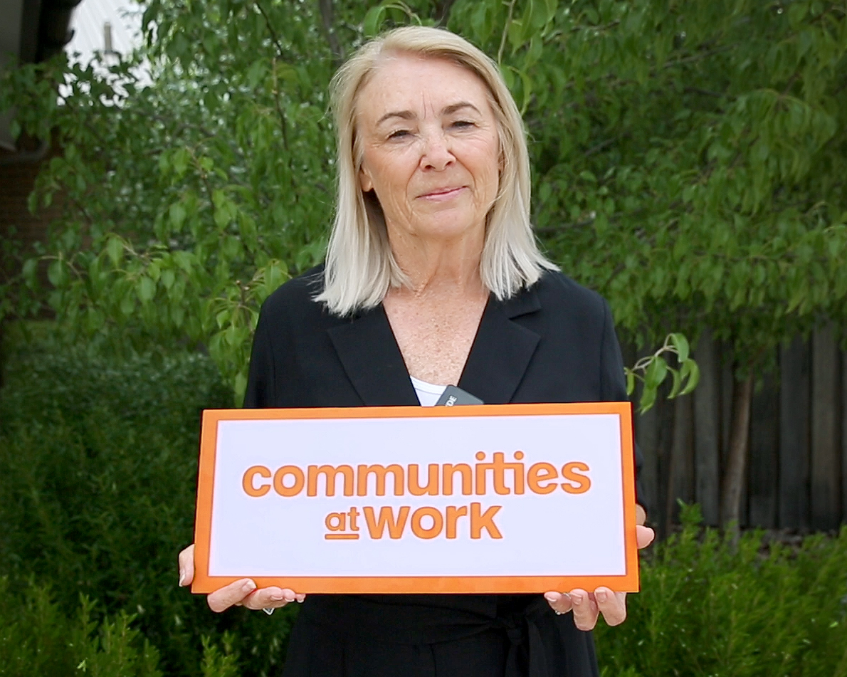
Brand refresh for Communities at Work to reflect its range of services

Canberra-based early childhood education and care (ECEC) and community services provider Communities at Work has refreshed its brand to better represent its services to the community.
The decision to refresh the brand was made after the organisation decided the Communities at Work brand needed to better reflect the organisation’s ongoing commitment to enrich the lives of people in the Canberra community and build better futures.
“Our brand is the story of who we are, what we do, and how we support our community,” CEO Lee Maiden explained. “It comes from the people that use our services. So this brand refresh is all about the Canberra community”.
The refreshed visual identity was developed to more closely align with Communities at Work’s values, mission and purpose and better represent the organisation’s unique dedication to people and its passion for creating positive social change in the Canberra community.
As a result of the change Communities at Work hopes that the new branding will better tell the story of its work, and emphasise the desire for continuous improvement and development.
That being said, Ms Maiden continued, the change of brand “doesn’t change who we are. We are still very committed to the Canberra community and always will be. Now we have this beautiful fresh new look to better reflect this.”
Designed and developed by the inhouse marketing and communications team, the new brand look has an updated logo, typeface, colours and imagery. The organisation’s name and logo have evolved from ‘Communities@Work’ to ‘Communities at Work’, upholding existing expectations of what the brand stands for while moving the organisation forward.
The familiar and friendly orange colour by which Communities at Work is known has been retained, and is now complemented with blue, a colour associated with feelings of trust and integrity, reflecting Communities at Work’s values.
As part of the brand refresh, Communities at Work commissioned local Ngunnawal artist, Bradley Mapiva Brown to create new artwork. This artwork depicts waterholes, which signify progress and sustainability for all Aboriginal peoples. The artist perceived this as a shared core value of Communities at Work.
“We’re humbled to have such meaningful brand artwork created for us by Bradley, signifying our connection to the land on which we’ve been working for over 43 years,” Ms Maiden shared. “We are proud of the services we deliver to the community on Ngunnawal land. In response to that commitment, we are excited to launch our brand refresh.”
To learn more about Communities at Work, see here.
Popular

Practice
Provider
Quality
Research
Workforce
New activity booklet supports everyday conversations to keep children safe
2025-07-10 09:00:16
by Fiona Alston

Quality
Practice
Provider
Workforce
Reclaiming Joy: Why connection, curiosity and care still matter in early childhood education
2025-07-09 10:00:07
by Fiona Alston

Policy
Practice
Provider
Quality
Research
Workforce
Beyond the headlines: celebrating educators and the power of positive relationships in early learning
2025-07-07 10:00:24
by Fiona Alston


